There is a persistent myth in the world of home design that space is the most important ingredient in a beautiful, liveable home. That until you have the square footage, the high ceilings, the sprawling open-plan layout — you’re working with limitations, not possibilities.
It’s a myth worth dismantling. Loudly.
Some of the most breathtaking, most liveable, most genuinely enviable homes in the world are small. Not despite their size — because of what their owners and designers chose to do with it. Constraint, it turns out, is one of the most powerful creative forces in interior design. It demands intentionality. It eliminates the lazy option of simply filling space. And when constraint is met with the right principles, the result is a home that feels curated, calm, and — paradoxically — far larger than its floor plan suggests.
In 2026, with urban living pushing more people into smaller apartments, studios, and compact houses than ever before, these principles aren’t just aesthetically interesting. They’re essential.
Here are the design rules that actually work.
Rule One: Light Is the Most Powerful Space-Maker You Have
Before you move a single piece of furniture or repaint a single wall, address the light.
Natural light is the single most effective tool for making a small space feel expansive — and most people are unconsciously blocking it. Heavy curtains hanging past the window frame. Furniture positioned directly in front of a light source. Dark walls absorbing illumination rather than reflecting it. Each of these choices quietly compresses a room, making it feel smaller and heavier than its dimensions suggest.
The fix is methodical. Hang curtains as high as possible — ideally from ceiling height — and extend the rod well past the window frame on both sides. This creates the optical illusion of a much larger window and floods the room with more light than the actual opening provides. Swap heavy draping for sheer linen panels that filter light rather than block it. Position mirrors on walls directly opposite windows to bounce daylight deeper into the room.
Light-coloured walls — specifically warm whites, soft creams, and pale stone tones — reflect rather than absorb light, visually expanding the room without a structural change in sight. This is not a compromise aesthetic. In 2026, the most coveted interior palette globally is exactly this — warm, pale, luminous. Small space living and high design are, for once, pointing in exactly the same direction.
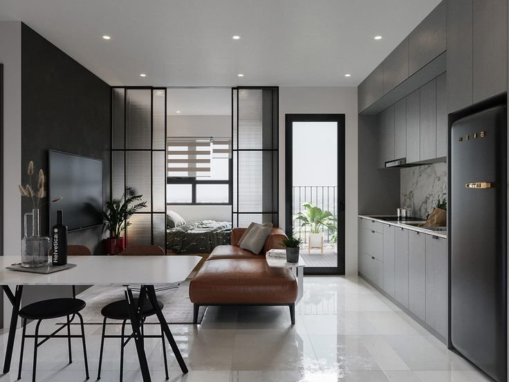
Rule Two: Vertical Space Is Almost Always Wasted
Look up. In most small homes, everything is happening between the floor and about two metres of height. Everything above that — in rooms that often extend to two point four or two point seven metres — is empty, unaddressed wall.
Designers see that space as prime real estate. Most homeowners don’t see it at all.
Floor-to-ceiling shelving draws the eye upward and immediately makes a room feel taller — while simultaneously solving storage problems that are usually endemic in small homes. Tall wardrobes that reach the ceiling eliminate the awkward dead space above standard-height furniture where dust accumulates and visual clutter gathers. Pendant lights hung from ceiling height elongate a room in a way that table lamps simply cannot replicate.
The principle is consistent: anything that encourages the eye to travel vertically makes a space feel bigger. Anything that keeps activity and visual interest pinned to a horizontal band across the middle of a room makes it feel smaller than it is.
Rule Three: Every Piece of Furniture Needs to Earn Its Place
This is the rule that genuinely transforms small spaces — and the one that requires the most discipline to implement.
In a large home, furniture that’s merely decorative or marginally functional can be accommodated. In a small home, it cannot. Every piece of furniture must justify its floor space through either utility, beauty, or ideally both. The moment you start eliminating pieces that fail this test, something remarkable happens to a small room: it breathes.
Multi-functional furniture is the obvious expression of this principle. An ottoman that opens for storage. A bed with deep drawers built into the base. A dining table that folds against a wall when not in use. A sofa with a built-in daybed extension. Each of these serves two needs with one footprint — and in a small home, that double efficiency compounds dramatically across a whole space.
Equally important is the choice of furniture scale. The instinct in a small room is often to choose small furniture — miniature sofas, tiny coffee tables, petite bedside tables — on the assumption that smaller furniture makes a room feel larger. This instinct is almost always wrong. A single, well-proportioned sofa in a small living room reads as intentional and sophisticated. Three small, mismatched pieces of seating read as cluttered and cramped. One considered piece, scaled appropriately, will consistently make a room feel bigger than several smaller ones competing for visual attention.
Rule Four: Colour Zoning Creates the Illusion of Separate Spaces
In open-plan small homes — the studio apartments and single-room living situations that define urban housing in 2026 — the challenge is not just making the space feel bigger. It’s making it feel like more than one space.
Colour zoning is the designer’s solution.
By using a slightly different wall colour, a distinct rug, or a change in lighting tone to delineate a sleeping area from a living area from a working area, you create psychological boundaries that the floor plan doesn’t provide. The eye and brain process these zones as distinct rooms, even when no wall separates them. The overall effect is a home that feels more spacious, more organised, and more intentionally designed — all without a single structural change.
The key is subtlety. The zones don’t need dramatically different colours to register as distinct. A warm white living area transitioning to a slightly deeper greige sleeping zone, anchored by a textured rug — that’s enough. Heavy-handed colour contrasts in a small space create visual noise rather than visual definition.
Rule Five: Clutter Is the Enemy of Space — And Most of It Is Hidden in Plain Sight
No design principle, no matter how expertly applied, can overcome clutter. A small space with clutter is just a cluttered small space. A small space without clutter is something else entirely — something that feels calm, considered, and genuinely generous in its proportions.
The problem is that most people don’t recognise their clutter as clutter. It’s the collection of objects on every surface. The books stacked on the floor beside the shelf that’s already full. The kitchen counter colonised by appliances used twice a year. The entryway that has quietly accumulated six months of unresolved decisions about where things should live.
The discipline of a small home demands that every object has a designated home — and that surfaces are treated as design elements, not storage solutions. This isn’t minimalism for minimalism’s sake. It’s the practical reality that in a small space, every surface that isn’t deliberately edited reads as visual noise, and visual noise makes rooms feel smaller.
The payoff for getting this right is disproportionate to the effort. A small home that is genuinely well-edited — in its furniture, its objects, its surfaces — doesn’t feel small at all. It feels like exactly enough.
The Mindset Shift That Changes Everything
The deepest truth about small space design is not a rule about curtain placement or furniture scale. It’s a shift in how you think about your home.
A small home is not a large home with things removed. It is its own category — one that rewards intentionality, punishes accumulation, and generously returns every considered decision with a space that feels better than its dimensions suggest it should.
The designers who work best with small spaces don’t approach them as constraints to overcome. They approach them as invitations to be precise. To choose only what’s needed. To make every element earn its place.
That precision, applied consistently, produces homes that feel not just liveable — but genuinely, unmistakably beautiful.
Square footage sets the limit. Design decides everything else.