

If you’ve flipped through a home magazine, scrolled through interior design feeds, or watched any house-flipping show over the last fifteen years, you already know the exact kitchen layout I’m talking about. Crisp white shaker cabinets, bright white subway tile running all the way to the ceiling, a pale quartz countertop, and maybe a polished nickel faucet if the owners were feeling adventurous.
For a long time, this was the undisputed king of kitchen design. It made total sense on paper. White felt clean, it bounced whatever natural light you had around dark corners, and real estate agents swore up and down that it was the only safe option if you ever wanted to sell your home.
But somewhere along the way, the trend got completely out of hand. Our kitchens stopped looking like comfortable, lived-in spaces where families cook dinners, mess up countertops, and catch up after long days. Instead, they started looking like sterile, bleach-cleaned operating rooms. We traded personality for safe choices, and frankly, people are exhausted by it.
That is why the design shift happening right now feels like such a massive breath of fresh air. Homeowners and designers alike are finally throwing out the old playbook and losing their fear of dark, dramatic paint.
Trading Blinding Brightness for Real Atmosphere
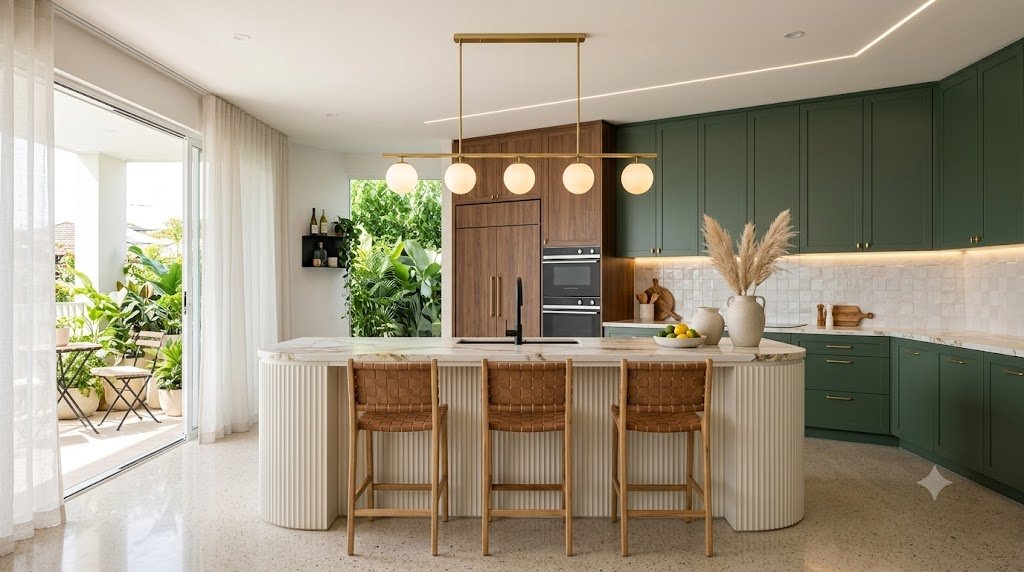
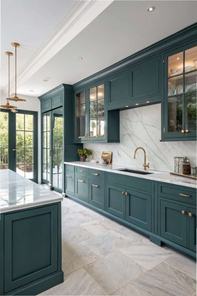
Walk into a newly remodeled kitchen today, and you are far less likely to be blinded by seamless white surfaces. Instead, you’ll spot cabinets painted in deep forest greens, moody dark navies, smoky charcoals, and even rich, earthy espresso browns.
Rather than trying to force every single square inch of the room to be as bright as possible, modern design is embracing shadows, depth, and contrast.
It turns out that moody, saturated colors do something white paint simply can’t pull off: they make a room feel immediately cozy and grounded. When you paint a kitchen island or a wall of cabinetry in a deep, rich shade, the room stops feeling like an oversized, open-plan showroom. It starts feeling like an actual sanctuary—a warm, inviting hub where you genuinely want to sit with a fresh cup of coffee in the morning or pour a glass of wine with friends late into the evening.
Dark colors bring a sense of history, permanence, and architecture to a house. They make new construction feel like it has soul, and they give older homes the weight and character they deserve.
How to Go Dark Without Feeling Like You’re Sitting in a Cave
Now, the main reason most people hesitated to use dark colors in the kitchen for so long was a very simple fear: nobody wants their cooking space to feel like a tiny, gloomy closet.
It’s a valid concern, but it comes from a basic misunderstanding of how color works. In reality, dark paint doesn’t automatically shrink a room. It just changes how light behaves inside it. Where glossy white paint bounces every ray of light around like a pinball, dark matte surfaces absorb light, which actually blurs the edges of a room and creates a surprising sense of visual depth.
The real secret to making a moody kitchen work comes down to balance and texture. It’s not just about slathering dark paint on every wall and calling it a day—it’s about what you place next to that paint.
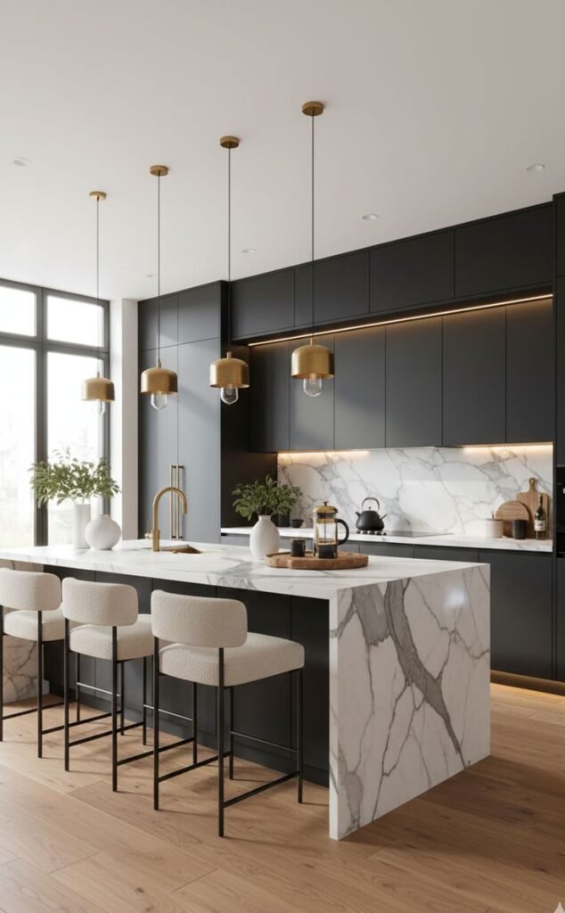
If you paint your cabinets a deep charcoal gray and surround them with stainless steel, cold white tile, and harsh overhead fluorescent lights, yes, the room is going to feel cold and depressing. But if you take that same charcoal paint and pair it with warm, unlacquered brass handles that show a bit of age, a raw oak butcher block island, and soft, warm lighting tucked under the shelving, the entire room lights up with texture and warmth.
The goal isn’t to eliminate light altogether; it’s to create intentional contrast between rich dark surfaces and natural, tactile materials.
The Death of the “Safe for Resale” Trap
Perhaps the healthiest part of this movement toward moody, personal kitchens is what it says about how we view our homes.
For nearly two decades, homeowners were practically brainwashed into decorating for an imaginary buyer ten years down the road rather than for themselves. Every choice—from the tile pattern to the paint swatch—was run through the filter of “will this turn off a potential homebuyer in 2035?”
That mindset drained all the joy out of interior design, flattening distinct personal tastes into a homogenized, mass-produced look.
Choosing a bold, moody palette is a quiet declaration that your home belongs to you, right now. It acknowledges that the kitchen is the hard-working emotional core of the household, not a sterile asset meant to sit pristine for a future appraisal. Whether you choose a deep botanical green that brings the outdoors in, or a velvety plum that feels like a cozy European bistro, you are building a space that reflects real life, real character, and genuine comfort.
We spent years playing it safe in the white-on-white era. It’s about time we welcomed color, warmth, and a little bit of drama back into the heart of the home.